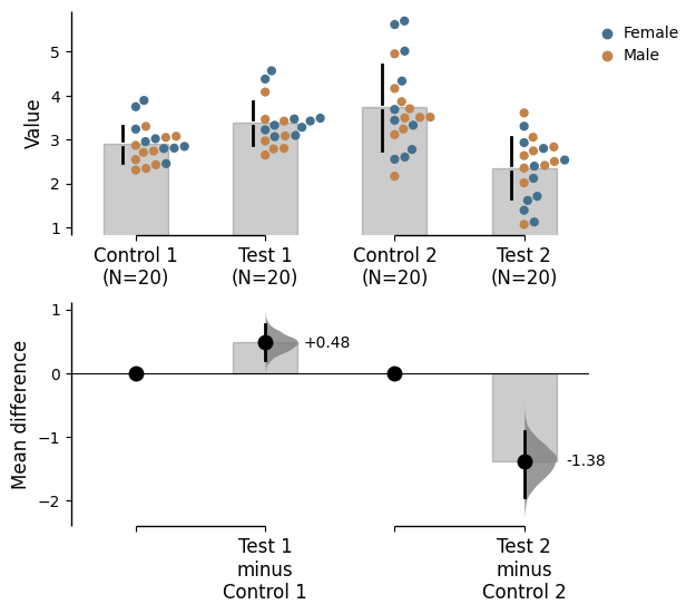
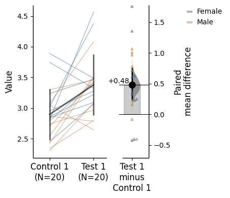
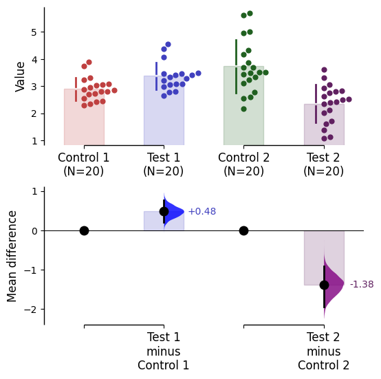
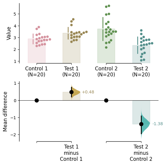
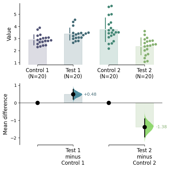
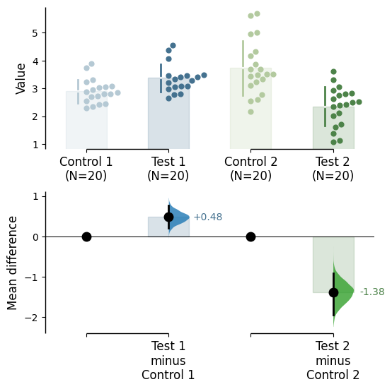
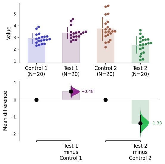
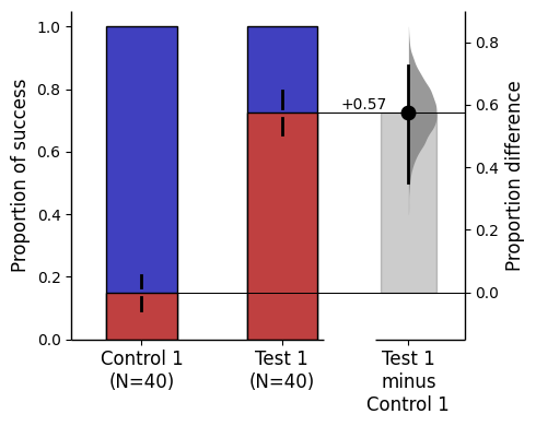
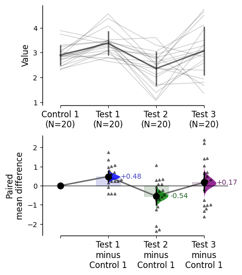
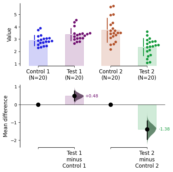
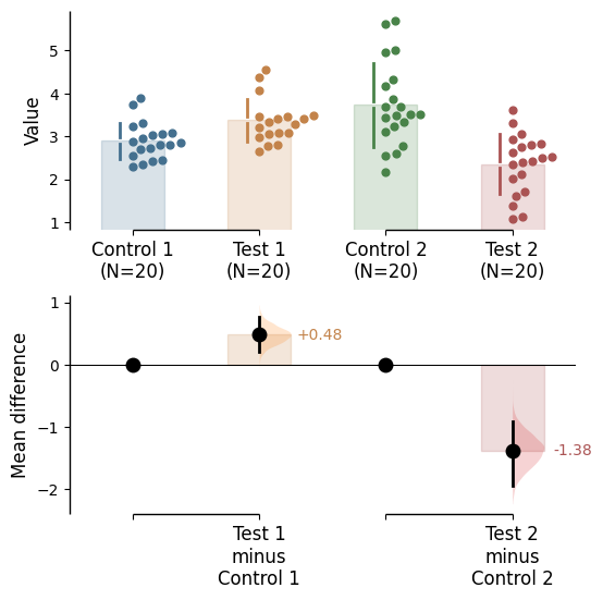
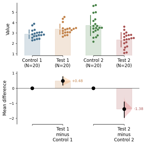
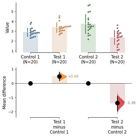
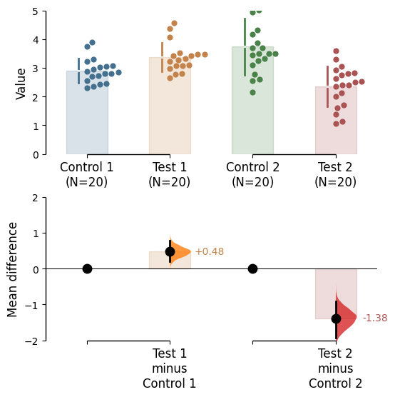
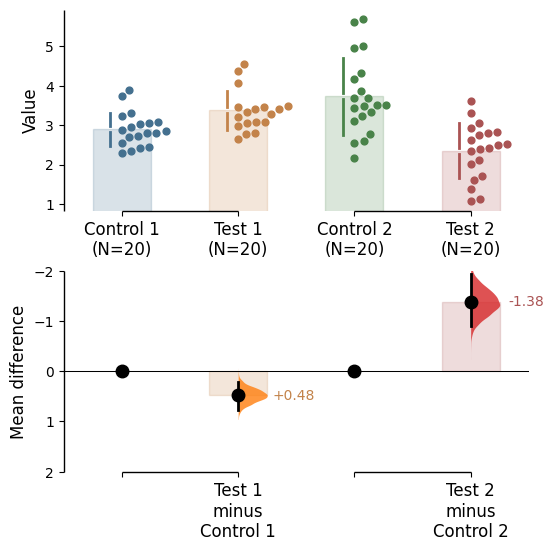
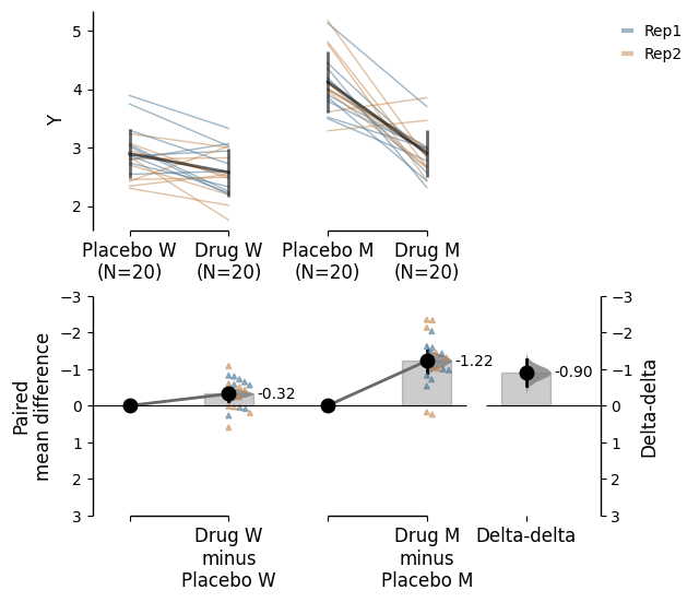
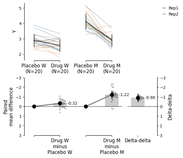
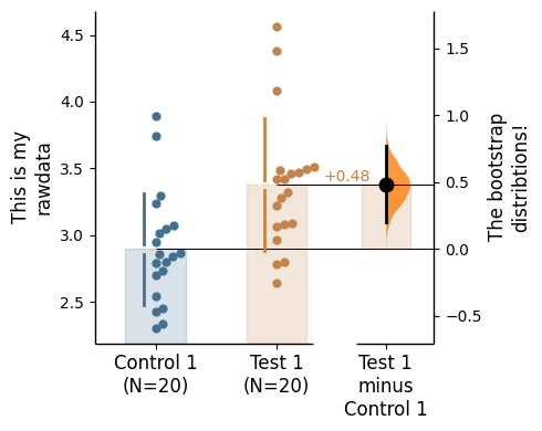
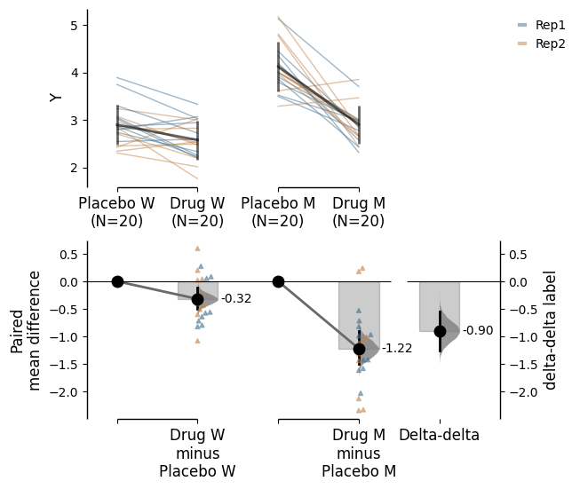
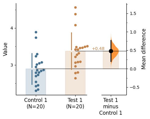
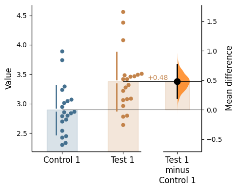
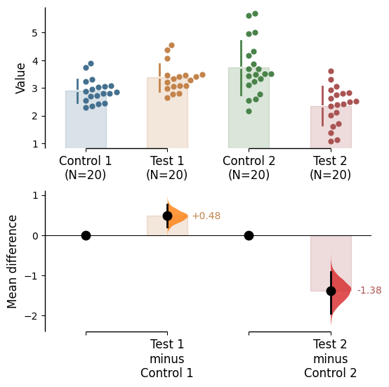
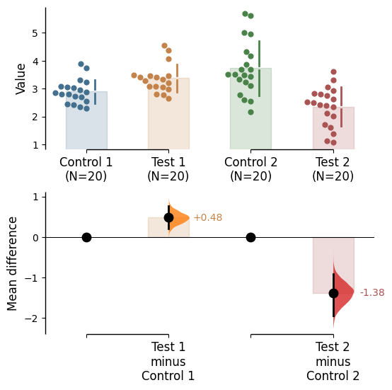
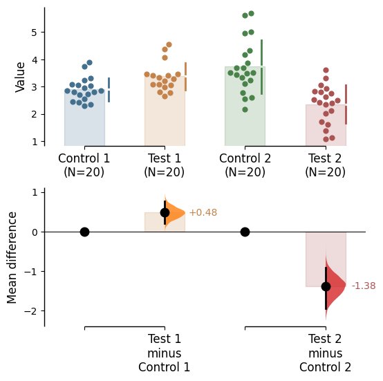
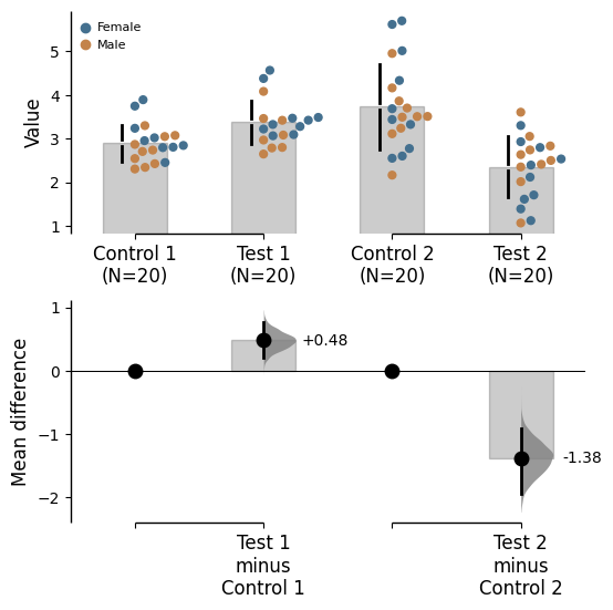
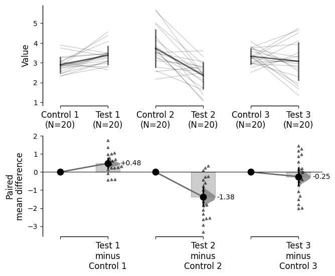
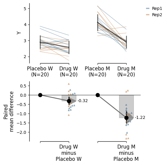
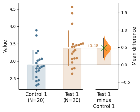
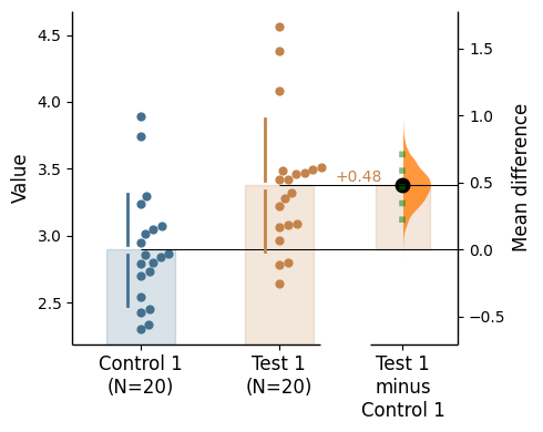
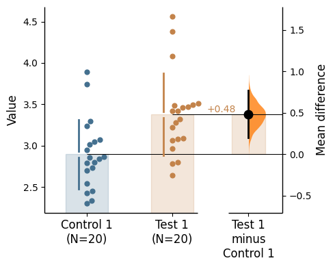
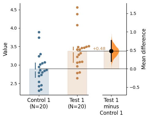
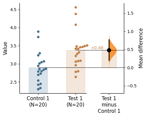
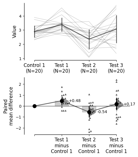
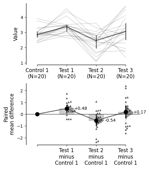
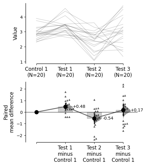
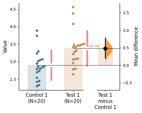
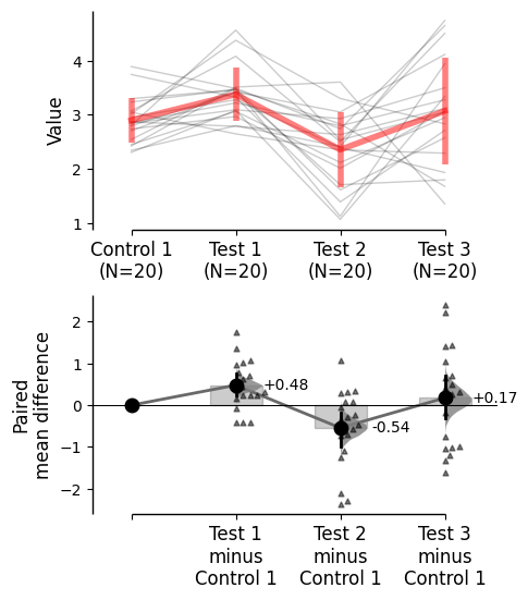
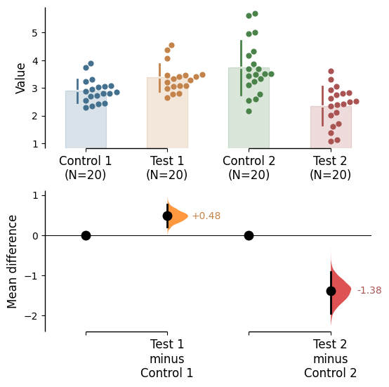
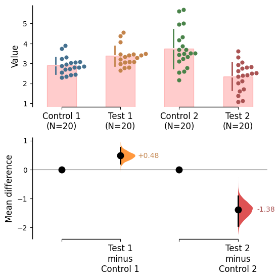
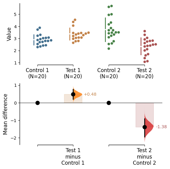
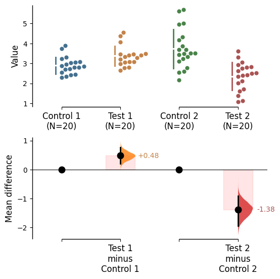
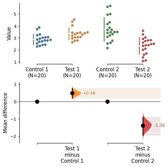
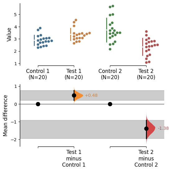
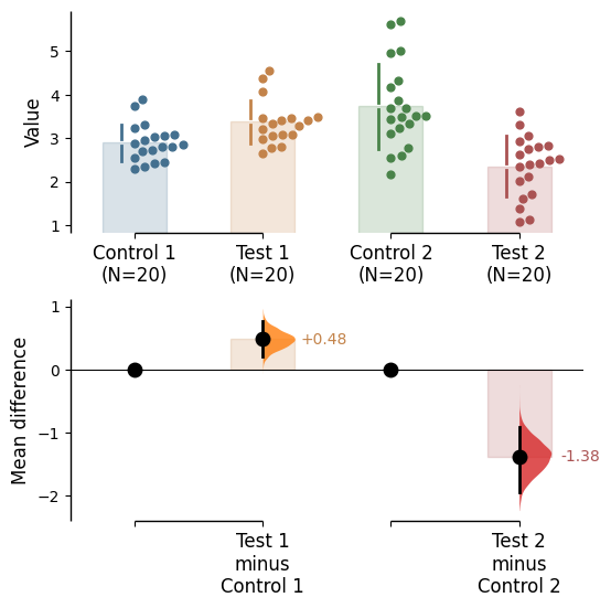
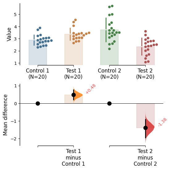
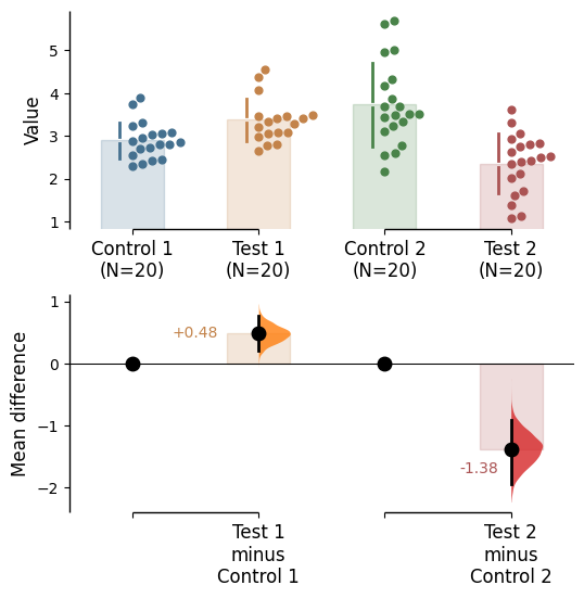
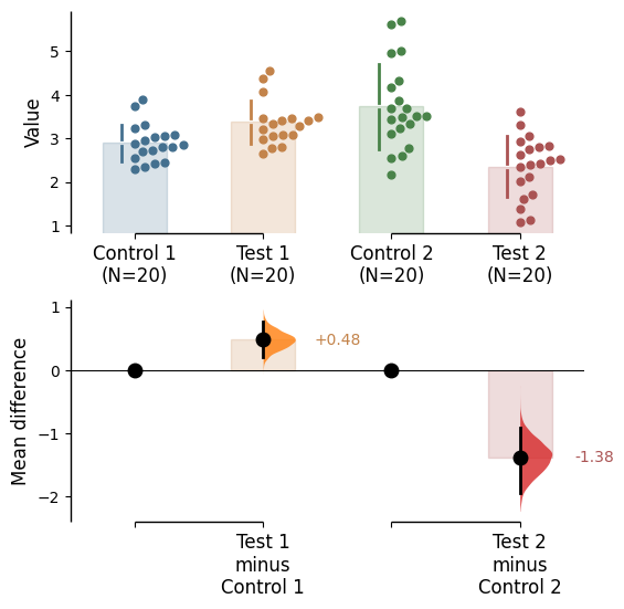
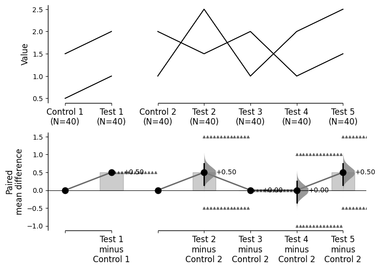
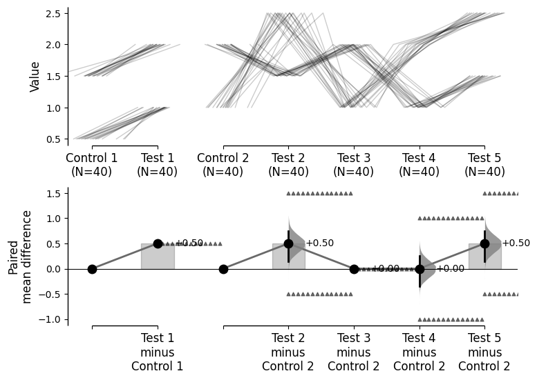
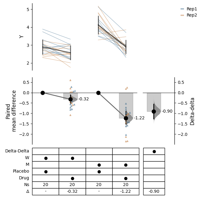
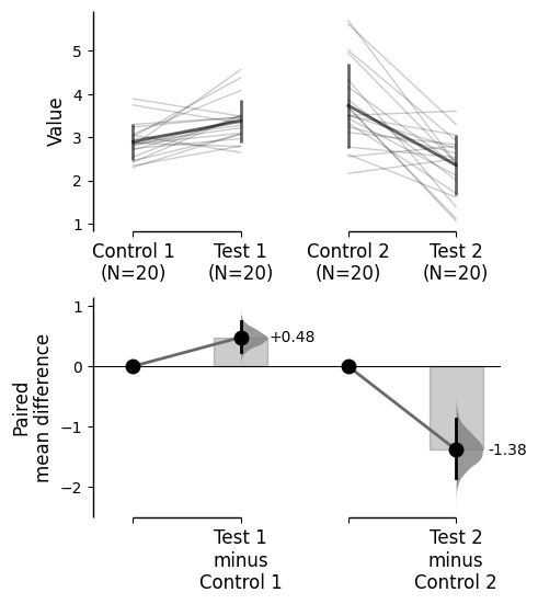
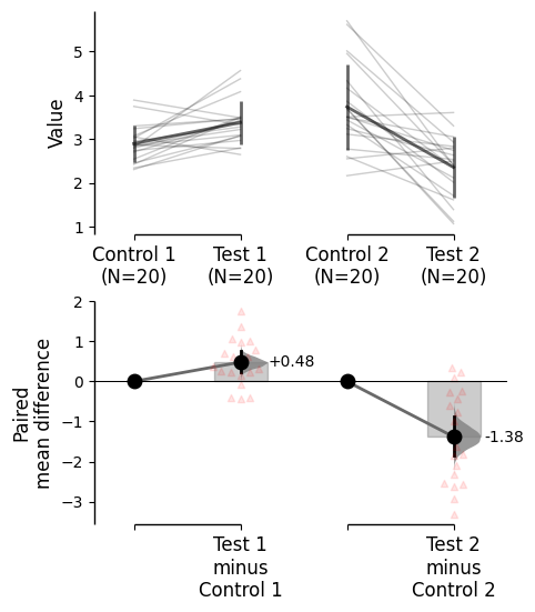
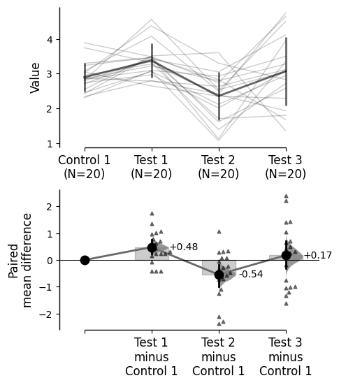
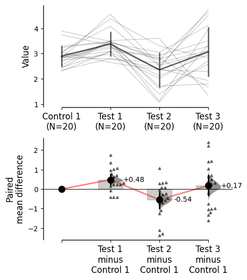
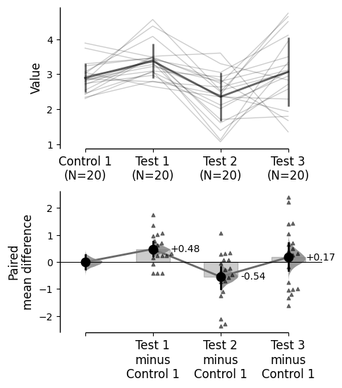
The colour palette for the graph can be changed using the parameter custom_palette. Multiple types of color palettes can be used:
A list of colors (named colors, hex, rgb, etc) e.g. ['red', 'blue', 'green']
A seaborn color palette e.g. 'Set1'
A matplotlib color map e.g. 'viridis'
'paired' is an interesting option for two-group (or multi two-group) comparisons
A dictionary with the keys as the column names and the values as the colors e.g. {'Control 1': 'red', 'Test 1': 'blue', 'Test 2': 'green'}
Or, a dictionary with the keys as the binary options for proportion plots (barplots and sankey) and the values as the colors e.g. {0: 'red', 1: 'blue'}
There are many ways to specify matplotlib colours. Find one example below using accepted colour names, hex strings (commonly used on the web), and RGB tuples.
my_color_palette = {"Control 1" : "blue","Test 1" : "purple","Control 2" : "#cb4b16", # This is a hex string."Test 2" : (0., 0.7, 0.2) # This is a RGB tuple. }multi_2group.mean_diff.plot(custom_palette=my_color_palette);
For proportion plots (barplots and sankey), a color palette dict can also be supplied via {1: first_color, 0, second_color} where first_color and second_color are valid matplotlib colours.
Color palette changes also now affect the effect size curve colors in paired plots
Note: The first color in the custom palette is used for the control group. As in the example below, if show_baseline_ec is set to False, it wont be represented in the plot.
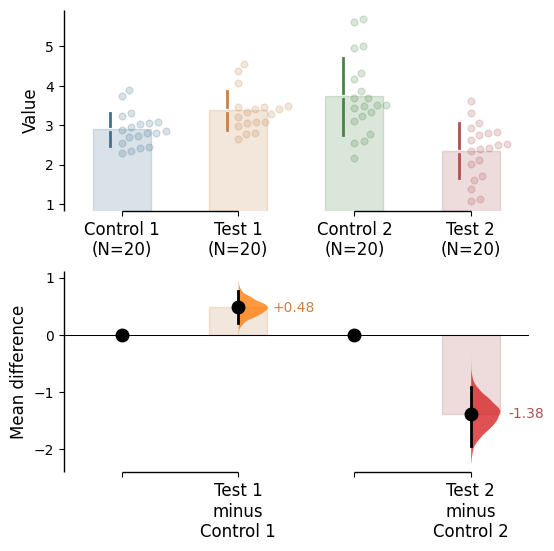
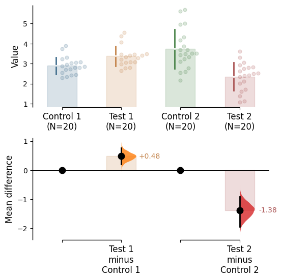
It is possible change the transparency of the raw data by using the raw_alpha parameter. This can also be achieved by adding alpha to the relevant rawdata kwargs (barplot_kwargs, or swarmplot_kwargs, or slopegraph_kwargs, or sankey_kwargs)
It is also possible change the transparency of the effect size curves by using the contrast_alpha parameter. This can also be achieved via adding alpha to the contrast_kwargs parameter.
It is possible change the size of the dots used in the rawdata swarmplot, as well as those to indicate the effect sizes, by using the parameters raw_marker_size and contrast_marker_size respectively.
You can add minor ticks and also change the tick frequency by accessing the axes directly.
Each estimation plot produced by dabest has two axes. The first one contains the rawdata swarmplot while the second one contains the bootstrap effect size differences.
import matplotlib.ticker as Tickerf = two_groups_unpaired.mean_diff.plot()rawswarm_axes = f.axes[0]contrast_axes = f.axes[1]rawswarm_axes.yaxis.set_major_locator(Ticker.MultipleLocator(1))rawswarm_axes.yaxis.set_minor_locator(Ticker.MultipleLocator(0.5))contrast_axes.yaxis.set_major_locator(Ticker.MultipleLocator(0.5))contrast_axes.yaxis.set_minor_locator(Ticker.MultipleLocator(0.25))
Add counts to tick labels
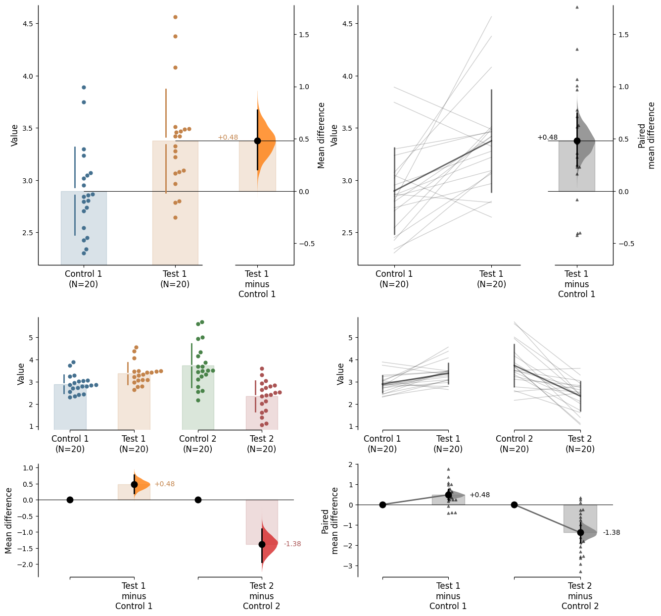
By default, the tick labels include the sample size for each group. This can be switched off via setting show_sample_size=False in the .plot() method.
from matplotlib import pyplot as pltf, axx = plt.subplots(nrows=2, ncols=2, figsize=(15, 15), gridspec_kw={'wspace': 0.25} # ensure proper width-wise spacing. )two_groups_unpaired.mean_diff.plot(ax=axx.flat[0]);two_groups_paired_baseline.mean_diff.plot(ax=axx.flat[1]);multi_2group.mean_diff.plot(ax=axx.flat[2]);multi_2group_paired.mean_diff.plot(ax=axx.flat[3]);
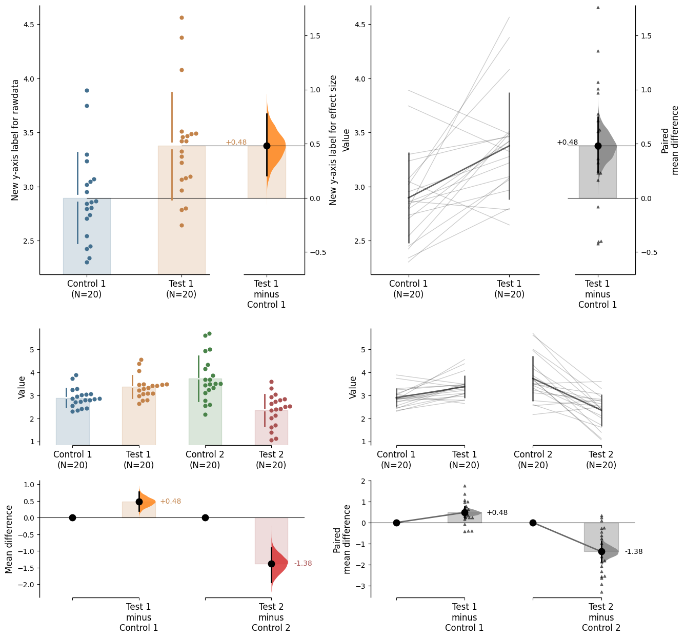
In this case, to access the individual rawdata axes, use name_of_axes to manipulate the rawdata axes, and name_of_axes.contrast_axes to gain access to the effect size axes.
topleft_axes = axx.flat[0]topleft_axes.set_ylabel("New y-axis label for rawdata")topleft_axes.contrast_axes.set_ylabel("New y-axis label for effect size")f
Legend
For plots with a color_col specified, a legend will be created. Utilise the legend_kwargs parameter to adjust the legend.
Modifying the appearance of the effect size error bar can be done via the contrast_errorbar_kwargs parameter. This parameter accepts a dictionary of keyword arguments.
The relevant inputs to contrast_errorbar_kwargs are:
'lw' - width of the error bar
'linestyle' - line style of the error bar
'color' - color of the error bar
'zorder' - zorder of the error bar (the layering relative to other plot elements)
Group summaries represent the summary statistics of the sample and are included by default.
In swarmplots and proportion plots, these are represented by gapped lines.
In slopegraphs, these are represented by a solid line connecting the group mean/median with error bars.
The type of group summary can be specified via group_summaries in the .plot() method and must be one of these: 'median_quartiles', 'mean_sd', None.
By default, the group summary is set to 'mean_sd'. For proportion and Sankey plots, the 'mean_sd' gapped line shows the BSE, not the standard deviation.
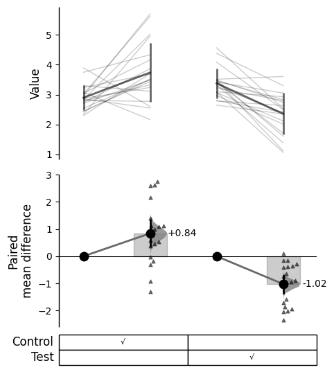
You can utilise a gridkey table format for representing the index groupings. This can be reached via gridkey in the .plot() method.
You can either use gridkey='auto' to automatically generate the gridkey, or pass a list of indexes to represent the groupings (e.g., gridkey=['Control', 'Test']).
paired_delta2.mean_diff.plot(gridkey='auto');
Gridkey kwargs can be utilised via gridkey_kwargs in the .plot() method.
The relevant inputs to gridkey_kwargs are:
'show_es' - Whether to show the effect size in the gridkey
'show_Ns' - Whether to show the sample sizes in the gridkey
'merge_pairs' - Whether to merge the pairs in the gridkey (paired data only)
'delimiters' - Delimiters to use for the autoparser. E.g., [‘;’, ‘>’, ’_’]
'marker' - Marker to use for filling the gridkey
'fontsize' - Font size of the gridkey text
'labels_fontsize' - Font size of the labels in the gridkey
In DABEST v2025.03.27, we introduce a new aspect to the contrast axes: the baseline dot and error curve. While the baseline dot is always present, the error curve can be turned on by setting show_baseline_ec=True in the .plot() method.