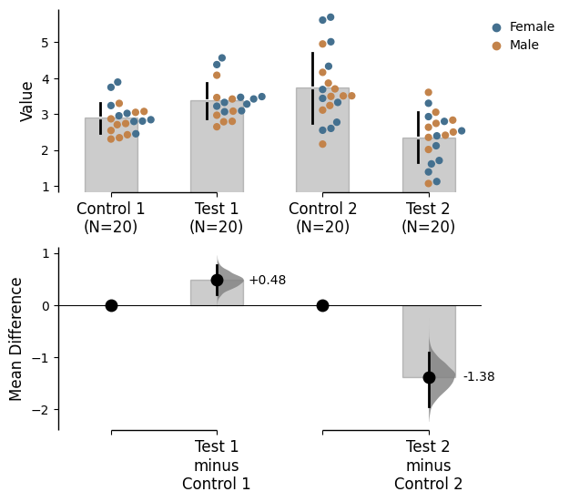
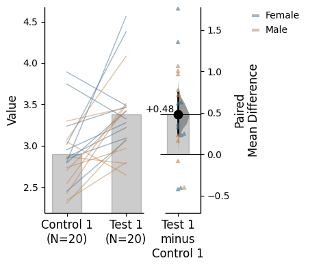
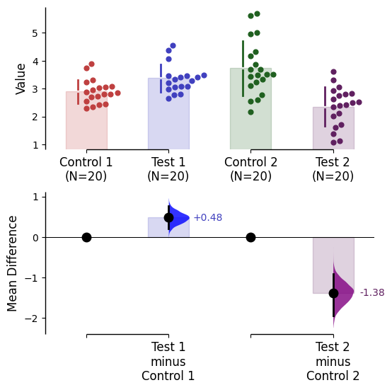
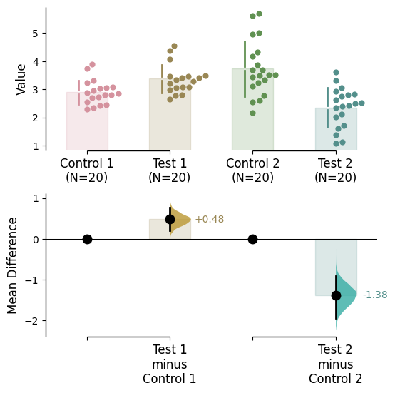
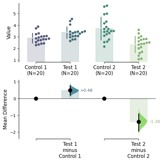
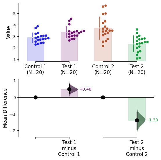
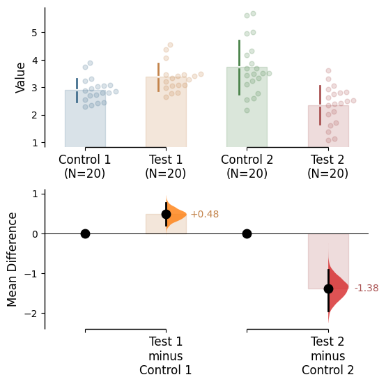
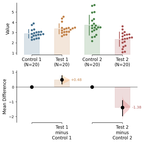
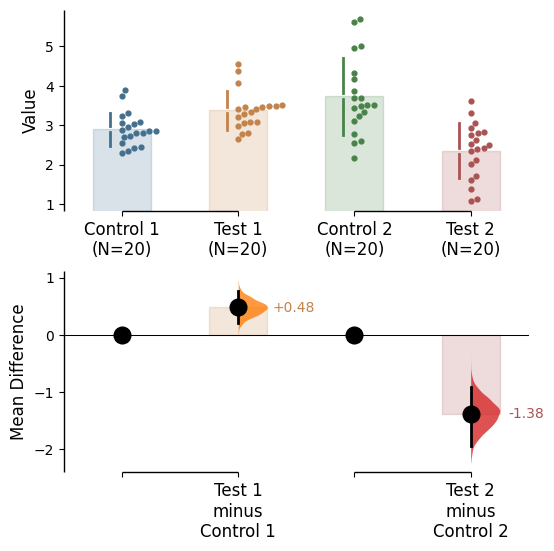
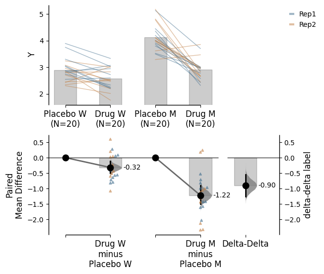
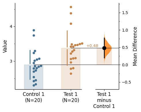
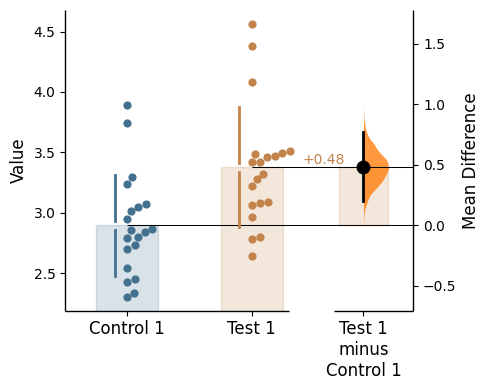
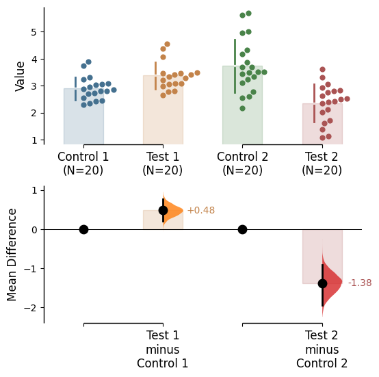
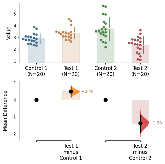
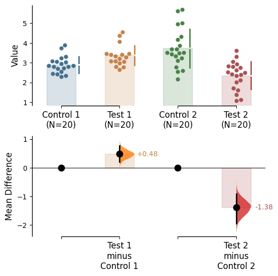
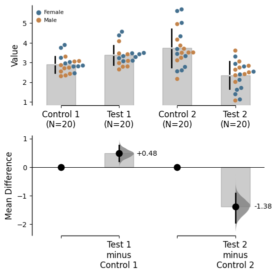
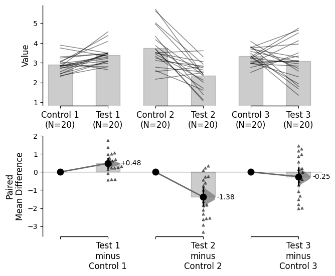
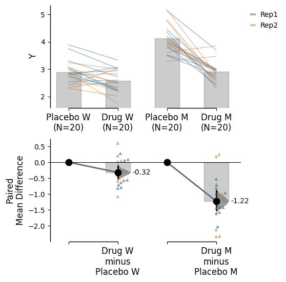
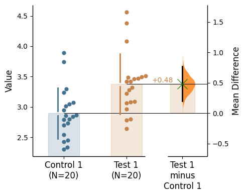
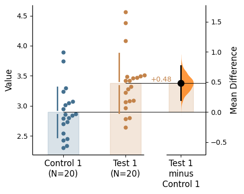
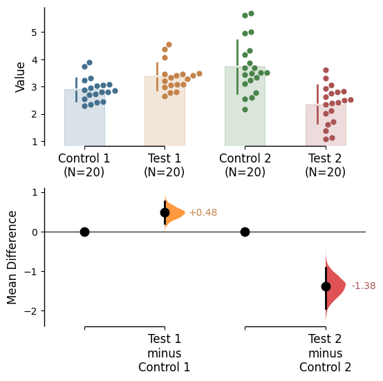
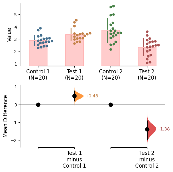
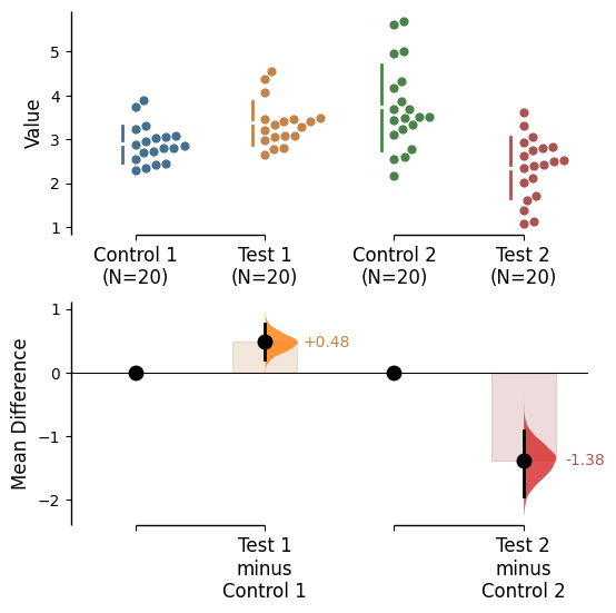
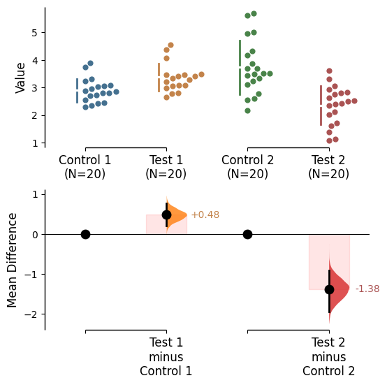
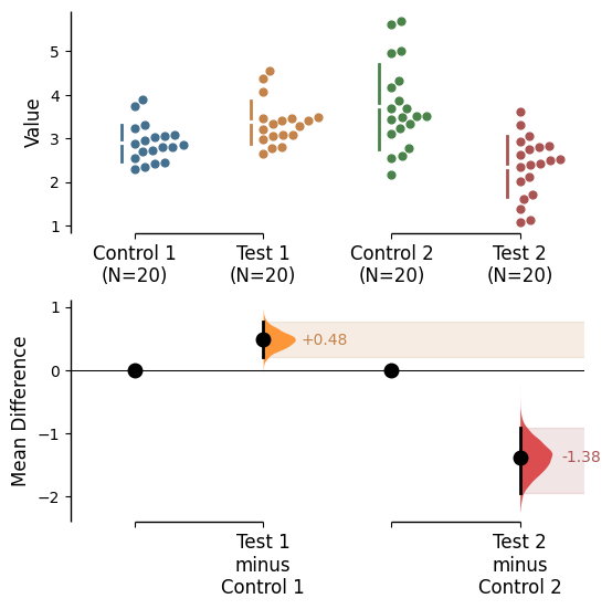
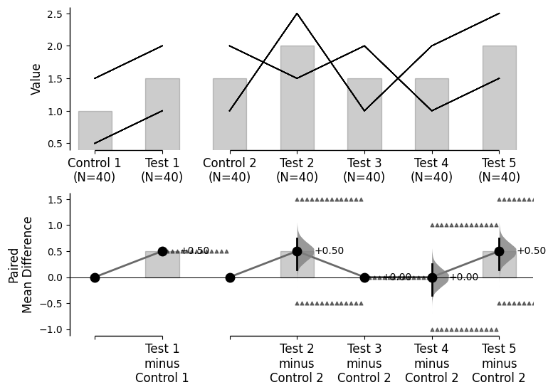
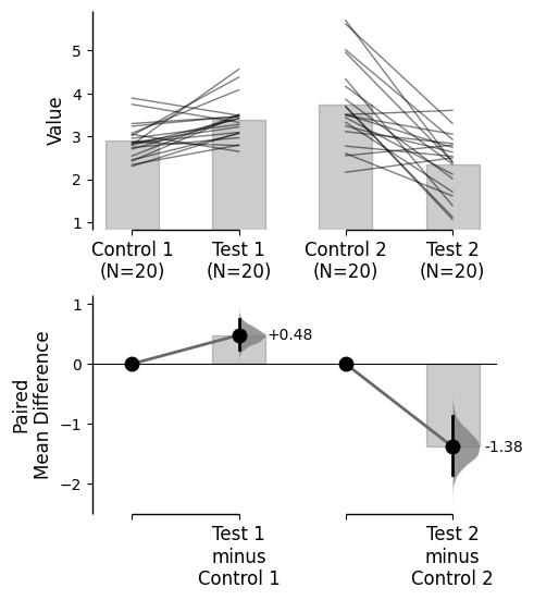
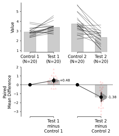
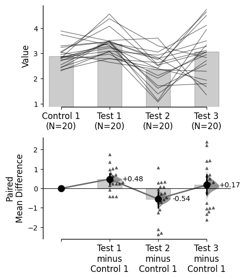
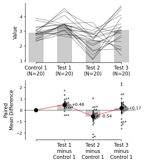
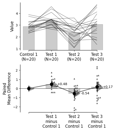
Since v2024.03.29 , swarmplots are, by default, plotted asymmetrically to the right side. For detailed information, please refer to Swarm Side .
Since v2025.03.27 , further aesthetic changes were added/updated which include:
Load libraries
import numpy as npimport pandas as pdimport dabestimport seaborn as snsprint ("We're using DABEST v {} " .format (dabest.__version__))
Pre-compiling numba functions for DABEST...
Compiling numba functions: 100%|██████████| 11/11 [00:00<00:00, 50.05it/s]
Numba compilation complete!
We're using DABEST v2025.03.27
Creating a demo dataset
from scipy.stats import norm # Used in generation of populations. 9999 ) # Fix the seed to ensure reproducibility of results. = 20 # The number of samples taken from each population # Create samples = norm.rvs(loc= 3 , scale= 0.4 , size= Ns)= norm.rvs(loc= 3.5 , scale= 0.75 , size= Ns)= norm.rvs(loc= 3.25 , scale= 0.4 , size= Ns)= norm.rvs(loc= 3.5 , scale= 0.5 , size= Ns)= norm.rvs(loc= 2.5 , scale= 0.6 , size= Ns)= norm.rvs(loc= 3 , scale= 0.75 , size= Ns)= norm.rvs(loc= 3.5 , scale= 0.75 , size= Ns)= norm.rvs(loc= 3.25 , scale= 0.4 , size= Ns)= norm.rvs(loc= 3.25 , scale= 0.4 , size= Ns)# Add a `gender` column for coloring the data. = np.repeat('Female' , Ns/ 2 ).tolist()= np.repeat('Male' , Ns/ 2 ).tolist()= females + males# Add an `id` column for paired data plotting. = pd.Series(range (1 , Ns+ 1 ))# Combine samples and gender into a DataFrame. = pd.DataFrame({'Control 1' : c1, 'Test 1' : t1,'Control 2' : c2, 'Test 2' : t2,'Control 3' : c3, 'Test 3' : t3,'Test 4' : t4, 'Test 5' : t5, 'Test 6' : t6,'Gender' : gender, 'ID' : id_col9999 ) # Fix the seed so the results are replicable. # Create samples = 20 = norm.rvs(loc= 3 , scale= 0.4 , size= N* 4 )2 * N] = y[N:2 * N]+ 1 2 * N:3 * N] = y[2 * N:3 * N]- 0.5 # Add a `Treatment` column = np.repeat('Placebo' , N* 2 ).tolist()= np.repeat('Drug' , N* 2 ).tolist()= t1 + t2 # Add a `Rep` column as the first variable for the 2 replicates of experiments done = []for i in range (N* 2 ):'Rep1' )'Rep2' )# Add a `Genotype` column as the second variable = np.repeat('W' , N).tolist()= np.repeat('M' , N).tolist()= np.repeat('W' , N).tolist()= np.repeat('M' , N).tolist()= wt + mt + wt2 + mt2# Add an `id` column for paired data plotting. id = list (range (0 , N* 2 ))= id + id # Combine all columns into a DataFrame. = pd.DataFrame({'ID' : id_col,'Rep' : rep,'Genotype' : genotype, 'Treatment' : treatment,'Y' : ydef create_demo_prop_dataset(seed= 9999 , N= 40 ):import numpy as npimport pandas as pd9999 ) # Fix the seed to ensure reproducibility of results. # Create samples = 1 = np.random.binomial(n, 0.2 , size= N)= np.random.binomial(n, 0.2 , size= N)= np.random.binomial(n, 0.8 , size= N)= np.random.binomial(n, 0.6 , size= N)= np.random.binomial(n, 0.2 , size= N)= np.random.binomial(n, 0.3 , size= N)= np.random.binomial(n, 0.4 , size= N)= np.random.binomial(n, 0.5 , size= N)= np.random.binomial(n, 0.6 , size= N)= np.ones(N)= np.zeros(N)= np.zeros(N)# Add a `gender` column for coloring the data. = np.repeat('Female' , N / 2 ).tolist()= np.repeat('Male' , N / 2 ).tolist()= females + males# Add an `id` column for paired data plotting. = pd.Series(range (1 , N + 1 ))# Combine samples and gender into a DataFrame. = pd.DataFrame({'Control 1' : c1, 'Test 1' : t1,'Control 2' : c2, 'Test 2' : t2,'Control 3' : c3, 'Test 3' : t3,'Test 4' : t4, 'Test 5' : t5, 'Test 6' : t6,'Test 7' : t7, 'Test 8' : t8, 'Test 9' : t9,'Gender' : gender, 'ID' : id_colreturn df= create_demo_prop_dataset()= dabest.load(df_prop, idx= ("Control 1" , "Test 1" ), proportional= True , paired= "baseline" , id_col= "ID" )= dabest.load(df_prop, idx= ("Control 1" , "Test 1" ), proportional= True )= dabest.load(df, idx= ("Control 1" , "Test 1" ))= dabest.load(df, idx= (("Control 1" , "Test 1" ),("Control 2" , "Test 2" )))= dabest.load(df, idx= ("Control 1" , "Test 1" , "Test 2" , "Test 3" ),paired= "baseline" , id_col= "ID" )= dabest.load(df, idx= ("Control 1" , "Test 1" ), paired= "baseline" , id_col= "ID" )= dabest.load(df, idx= (("Control 1" , "Test 1" ), ("Control 2" , "Test 2" ), ("Control 3" , "Test 3" )), mini_meta= True , id_col= "ID" , paired= "baseline" )= dabest.load(data = df_delta2, = "baseline" , id_col= "ID" ,= ["Treatment" , "Rep" ], y = "Y" , = True , experiment = "Genotype" )
Changing the graph colours
Color categories from another variable
Use the parameter color_col to specify which column in the dataframe will be used to create the different colours for your graph.
= "Gender" ); = "Gender" );
Custom palette
The colour palette for the graph can be changed using the parameter custom_palette. Multiple types of color palettes can be used:
A list of colors (named colors, hex, rgb, etc) e.g. ['red', 'blue', 'green']
A seaborn color palette e.g. 'Set1'
A matplotlib color map e.g. 'viridis'
'paired' is an interesting option for two-group (or multi two-group) comparisons A dictionary with the keys as the column names and the values as the colors e.g. {'Control 1': 'red', 'Test 1': 'blue', 'Test 2': 'green'}
A list of colors
= ['red' , 'blue' , 'green' , 'purple' , 'orange' , 'brown' ]);
Seaborn color palette
= sns.color_palette("husl" , 6 ));
Matplotlib color map/palette
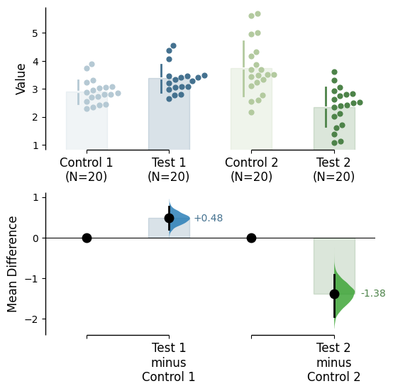
= "viridis" ); = "Paired" );
A user-defined dictionary
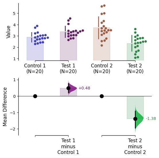
There are many ways to specify matplotlib colours. Find one example below using accepted colour names, hex strings (commonly used on the web), and RGB tuples.
= {"Control 1" : "blue" ,"Test 1" : "purple" ,"Control 2" : "#cb4b16" , # This is a hex string. "Test 2" : (0. , 0.7 , 0.2 ) # This is a RGB tuple. = my_color_palette);
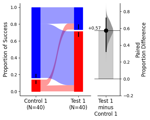
For sankey plots, a color palette dict can be supplied via {1: first_color, 0, second_color} where first_color and second_color are valid matplotlib colours.
= {1 : "red" , 0 : "blue" });
Color saturation
By default, dabest.plot() desaturates the colour of the dots in the swarmplot by 50%. This draws attention to the effect size bootstrap curves.
You can alter the default values with the parameters raw_desat and contrast_desat.
= my_color_palette,= 0.75 ,= 0.25 );
Alpha (transparency)
It is possible change the transparency of the raw data by using the raw_alpha parameter. This can also be achieved by adding alpha to the relevant rawdata kwargs (barplot_kwargs, or swarmplot_kwargs, or slopegraph_kwargs, or sankey_kwargs)
= 0.2 ); = {'alpha' : 0.2 });
It is also possible change the transparency of the effect size curves by using the contrast_alpha parameter. This can also be achieved via adding alpha to the contrast_kwargs parameter.
= 0.2 ); = {'alpha' :0.2 });
Marker size
It is possible change the size of the dots used in the rawdata swarmplot, as well as those to indicate the effect sizes, by using the parameters raw_marker_size and contrast_marker_size respectively.
= 3 ,= 12 );
Axes
Lims
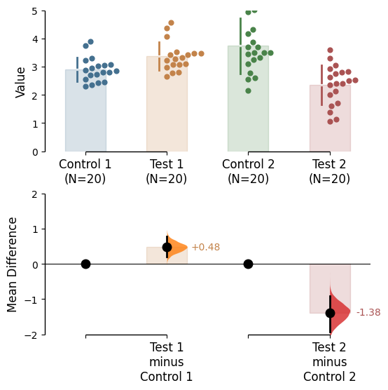
To change the y-limits for the rawdata axes, and the contrast axes, use the parameters raw_ylim and contrast_ylim.
= (0 , 5 ),= (- 2 , 2 ));
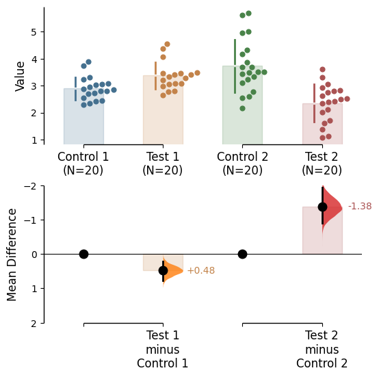
If the effect size is qualitatively inverted (ie. a smaller value is a better outcome), you can simply invert the tuple passed to contrast_ylim.
= (2 , - 2 ));
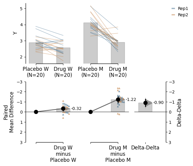
The contrast axes share the same y-limits as those of the delta-delta plot. Thus, the y axis of the delta-delta plot changes as well.
= (3 , - 3 ));
You can also change the y-limit of the delta-delta axes and the regular delta axes via the delta2_ylim parameter.
= (3 , - 3 ));
Labels
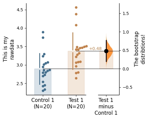
raw_label - label the raw data y-axiscontrast_label - label the contrast y-axis
= "This is my \n rawdata" , = "The bootstrap \n distribtions!" ;
Unique for delta-delta: - delta2_ylim - to label the delta-delta y-axis
= 'delta-delta label' );
Axes ticks
You can add minor ticks and also change the tick frequency by accessing the axes directly.
Each estimation plot produced by dabest has two axes. The first one contains the rawdata swarmplot while the second one contains the bootstrap effect size differences.
import matplotlib.ticker as Ticker= two_groups_unpaired.mean_diff.plot()= f.axes[0 ]= f.axes[1 ]1 ))0.5 ))0.5 ))0.25 ))
Add counts to tick labels
By default, the tick labels include the sample size for each group. This can be switched off via setting show_sample_size=False in the .plot() method.
= False ;
Changing swarm side
In dabest, swarmplots are, by default, plotted asymmetrically to the right side. You may change this by using the parameter swarm_side.
There are only three valid values: "right" (default), "left", "center".
= "right" ); = "left" ); = "center" );
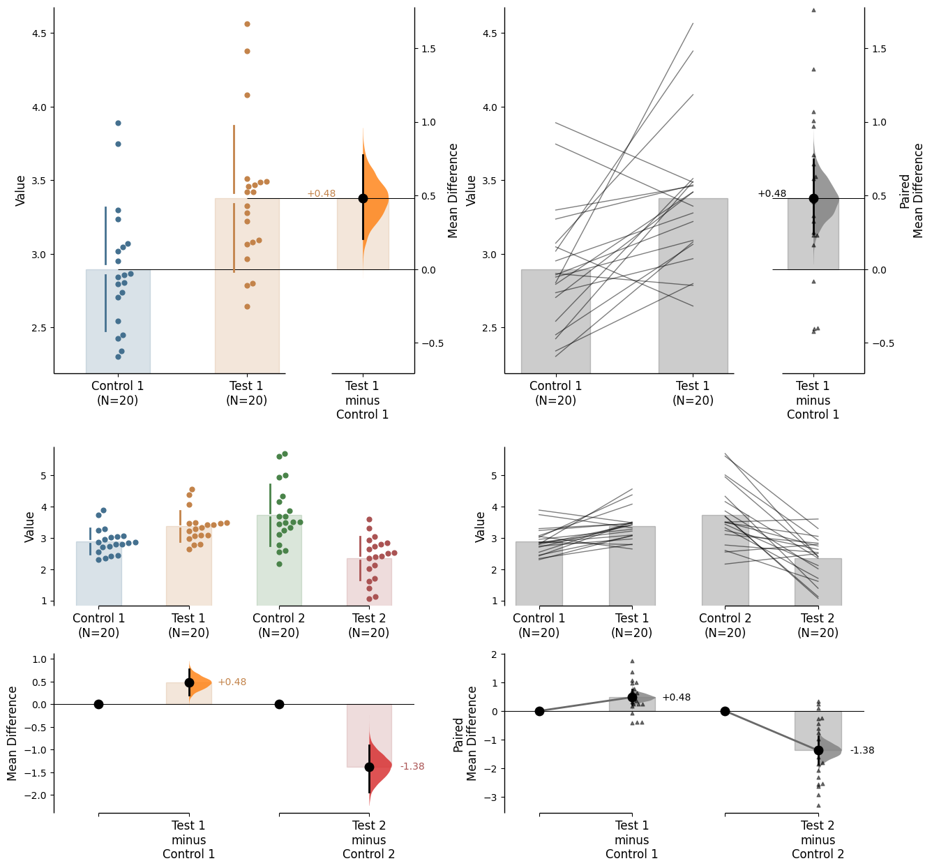
Creating estimation plots in existing axes
Implemented in v0.2.6 by Adam Nekimken .
dabest.plot has an ax parameter that accepts Matplotlib Axes. The entire estimation plot will be created in the specified Axes.
= dabest.load(df, idx= ("Control 1" , "Test 1" ),= "baseline" , id_col= "ID" )= dabest.load(df,= (("Control 1" , "Test 1" ),"Control 2" , "Test 2" )),= "baseline" , id_col= "ID" )
from matplotlib import pyplot as plt= plt.subplots(nrows= 2 , ncols= 2 ,= (15 , 15 ),= {'wspace' : 0.25 } # ensure proper width-wise spacing. = axx.flat[0 ]); = axx.flat[1 ]); = axx.flat[2 ]); = axx.flat[3 ]);
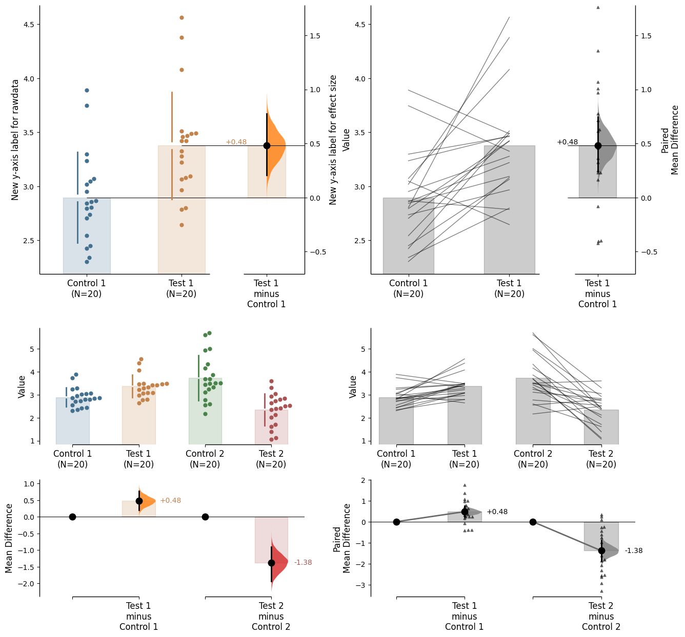
In this case, to access the individual rawdata axes, use name_of_axes to manipulate the rawdata axes, and name_of_axes.contrast_axes to gain access to the effect size axes.
= axx.flat[0 ]"New y-axis label for rawdata" )"New y-axis label for effect size" )
Legend
For plots with a color_col specified, a legend will be created. Utilise the legend_kwargs parameter to adjust the legend.
= "Gender" , = {'bbox_to_anchor' : [0 , 1 ], 'fontsize' :8 });
Hiding options
For mini-meta plots, it is possible to hide the weighted average plot by setting the parameter show_mini_meta=False in the .plot() method.
= False );
Similarly, you can hide the delta-delta effect size by setting show_delta2=False in the .plot() method.
= False );
Effect size error bar and marker
Modifying the effect size marker can be done via contrast_marker_kwargs. This parameter accepts a dictionary of keyword arguments.
The available options are:
'marker' - type of the marker'markersize' - size of the marker'color' - color of the marker'alpha' - alpha of the marker (transparency)'zorder' - zorder of the marker (the layering relative to other plot elements)
Note: markersize can also be modified directly via the contrast_marker_size argument
= {"marker" : "x" , 'markersize' : 15 , 'color' : 'green' , 'alpha' :0.8 , 'zorder' : 5 });
Modifying the appearance of the effect size error bar can be done via the contrast_errorbar_kwargs parameter. This parameter accepts a dictionary of keyword arguments.
The relevant inputs to contrast_errorbar_kwargs are:
'lw' - width of the error bar'linestyle' - line style of the error bar'color' - color of the error bar'zorder' - zorder of the error bar (the layering relative to other plot elements)'alpha' - alpha of the error bar (transparency)
= {'lw' : 4 , 'color' : 'green' , 'alpha' :0.5 , 'zorder' : 2 , 'linestyle' : ':' });
Group summaries
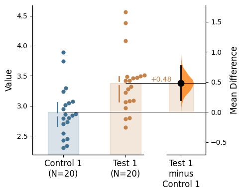
Group summaries are included in swarmplots by default. These are the gapped lines that represent the mean and the standard deviation of the sample.
The type of group summary (gapped line) can be specified via group_summaries in the .plot() method and must be one of these: 'median_quartiles', 'mean_sd', None.
By default, the group summary is set to 'mean_sd'.
= "mean_sd" ); = "median_quartiles" ); = None );
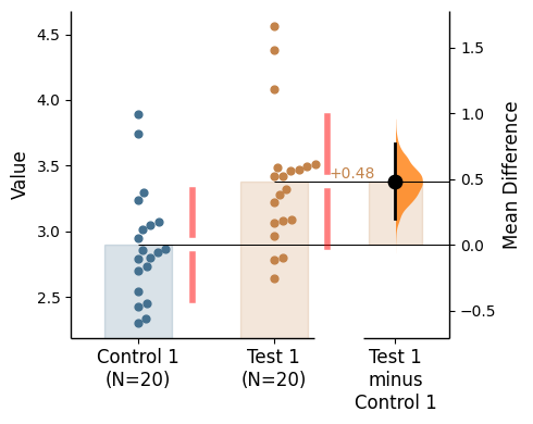
Group summaries have an associated kwargs group_summaries_kwargs
The relevant inputs to group_summaries_kwargs are:
'zorder' - zorder of the gapped lines (the layering relative to other plot elements)'lw' - linewidth of the gapped lines'alpha' - alpha of the gapped lines (transparency)'gap_width_percent' - gap size'offset' - location adjustment of the gapped lines (x-axis)'color' - the shared color of the gapped lines
= {'gap_width_percent' : 3 , 'alpha' : 0.5 , 'lw' : 4 , 'offset' : 0.6 , 'color' :'red' });
Raw bars
Raw bars are included in swarmplots and slopegraph plots by default. It can be turned off by setting raw_bars=False in the .plot() method.
= True , contrast_bars= False );
Raw bar kwargs can be utilised via raw_bars_kwargs in the .plot() method.
Pass any keyword arguments accepted by matplotlib.patches.Rectangle here, as a string.
= True , contrast_bars= False ,= {'color' : "red" , 'alpha' : 0.2 }, ;
Contrast bars
Contrast bars are included in all plots by default. It can be turned off by setting contrast_bars=False in the .plot() method.
= True , raw_bars= False );
Contrast bar kwargs can be utilised via contrast_bars_kwargs in the .plot() method.
Pass any keyword arguments accepted by matplotlib.patches.Rectangle here, as a string.
= True , raw_bars= False , = {'color' : "red" , 'alpha' : 0.1 };
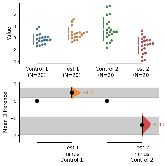
Reference band
A reference band can be added for each relevant contrast object as desired via supplying a list to the argument reference_band in the .plot() method.
= [0 , 1 ], contrast_bars= False , raw_bars= False );
Reference band kwargs can be utilised via reference_band_kwargs in the .plot() method.
The relevant inputs to reference_band_kwargs are:
'span_ax' - Whether the reference band(s) should span the entire x-axis or start from the relevant effect size curve'color' - Color of the reference band(s). If color is not specified, the color of the effect size curve will be used.'alpha' - Alpha of the reference band(s) (transparency)'zorder' - Zorder of the reference band(s) (the layering relative to other plot elements)
= [0 ,1 ], contrast_bars= False , raw_bars= False ,= {"alpha" : 0.2 , "color" : 'black' , 'span_ax' : True };
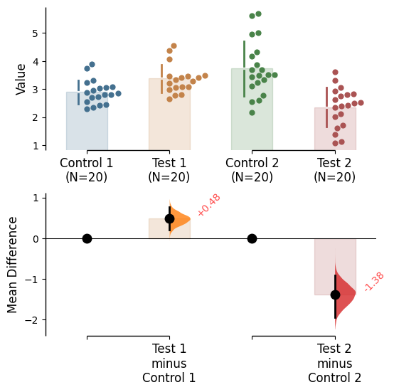
Delta text
Delta text is included in all plots by default. It can be turned off by setting delta_text=False in the .plot() method.
= True );
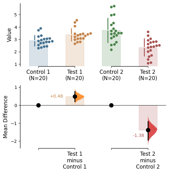
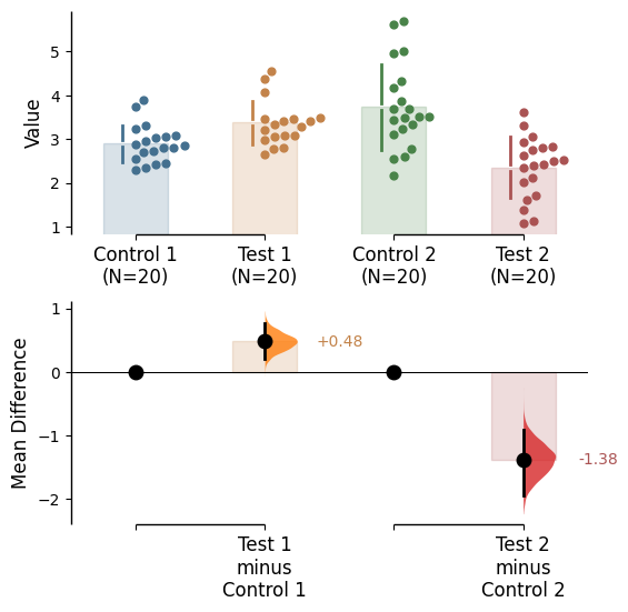
Delta text kwargs can be utilised via delta_text_kwargs in the .plot() method.
The relevant inputs to delta_text_kwargs are:
'color' - Color. If color is not specified, the color of the effect size curve will be used.'alpha'- Alpha (transparency)'fontsize' - Font size'ha' - Horizontal alignment'va' - Vertical alignment'rotation' - Text rotation'x_coordinates' - Specify the x-coordinates of the text'y_coordinates' - Specify the y-coordinates of the text'offset' - Am x-axis coordinate adjuster for minor movement of all text
Otherwise, pass any keyword arguments accepted by matplotlib.text.Text, as a string.
= True , = {"color" :"red" , "rotation" :45 , "va" :"bottom" , "alpha" :0.7 });
'x_coordinates' and/or 'y_coordinates' if you would like to specify the text locations manually.
= True , = {"x_coordinates" :(0.5 , 2.75 ), "y_coordinates" :(0.5 , - 1.7 )});
'offset' to adjust the x location of all the texts (positive moves right, negative left).
= True , = {"offset" :0.1 });
Adding jitter to slopegraph plots
For paired plots, you can add jitter to the slopegraph by adding a value for jitter in the slopegraph_kwargs parameter.
This can be useful for specific paired plots when there are many overlapping points.
Currently, jitter is only available for slopegraphs and only in the x-direction (vertical plots) or y-direction (horizontal plots).
# Jitter tests 9999 ) # Fix the seed to ensure reproducibility of results. = 20 # The number of samples taken from each population # Create samples = [0.5 ]* Ns + [1.5 ]* Ns= [2 ]* Ns + [1 ]* Ns= [1 ]* Ns + [2 ]* Ns= [1.5 ]* Ns + [2.5 ]* Ns= [2 ]* Ns + [1 ]* Ns= [1 ]* Ns + [2 ]* Ns= [1.5 ]* Ns + [2.5 ]* Ns= pd.Series(range (1 , 2 * Ns+ 1 ))= pd.DataFrame({'Control 1' : c1, 'Test 1' : t1,'Control 2' : c2, 'Test 2' : t2, 'Test 3' : t3,'Test 4' : t4, 'Test 5' : t5, 'ID' : id_col})
For the example below, there are many overlapping points for the paired plot, which makes it look like only one sample.
= dabest.load(df_jittertest, idx= (("Control 1" , "Test 1" ),("Control 2" , "Test 2" , "Test 3" , "Test 4" , "Test 5" )), paired= 'baseline' , id_col= 'ID' )= False );
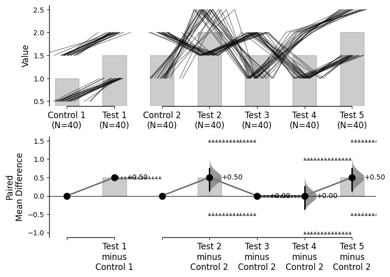
Adding jitter can help to visualize the data better.
= False , slopegraph_kwargs= {'jitter' : 1 });
Gridkey
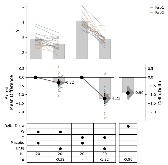
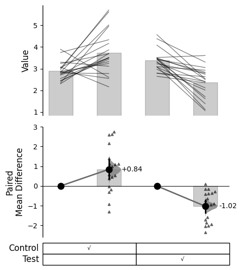
You can utilise a gridkey table format for representing the index groupings. This can be reached via gridkey in the .plot() method.
You can either use gridkey='auto' to automatically generate the gridkey, or pass a list of indexes to represent the groupings (e.g., gridkey=['Control', 'Test']).
= 'auto' );
Gridkey kwargs can be utilised via gridkey_kwargs in the .plot() method.
The relevant inputs to gridkey_kwargs are:
'show_es' - Whether to show the effect size in the gridkey'show_Ns' - Whether to show the sample sizes in the gridkey'merge_pairs' - Whether to merge the pairs in the gridkey (paired data only)'delimiters' - Delimiters to use for the autoparser. E.g., [‘;’, ‘>’, ’_’]'marker' - Marker to use for filling the gridkey'fontsize' - Font size of the gridkey text'labels_fontsize' - Font size of the labels in the gridkey
= dabest.load(df, idx= (("Control 1" , "Control 2" ), ("Test 1" , "Test 2" )),paired= 'baseline' , id_col= 'ID' )= ['Control' , 'Test' ], = {'merge_pairs' : True , 'show_es' : False , 'show_Ns' : False , 'marker' : '√' ,'fontsize' : 8 , 'labels_fontsize' : 12 });
Delta dot
By default, delta dots are included in paired experiment plots (excluding proportion plots).
This feature can be turned off by setting delta_dot=False in the .plot() method.
= False );
Delta dot kwargs can be utilised via delta_dot_kwargs in the .plot() method.
The relevant inputs to delta_dot_kwargs are:
'color' - Specify the color of the delta dots. If color is not specified, the color of the effect size curve will be used.'marker' - Marker of the dots. The default are triangles (‘^’)'alpha' - Alpha (Transparency)'zorder' - Zorder (the layering relative to other plot elements)'size' - Marker size'side' - Which side to plot the delta dots. The options are 'left', 'right', or 'center'. This functions like the swarm_side parameter.
= {"color" :'red' , "alpha" :0.1 , 'zorder' : 2 , 'size' : 5 , 'side' : 'center' });
Effect size paired lines
By default, effect size paired lines are included in paired experiment plots (excluding proportion plots).
This feature can be turned off by setting contrast_paired_lines=False in the .plot() method.
= True );
Effect size line kwargs can be utilised via contrast_paired_lines_kwargs in the .plot() method.
By default, the following keywords are passed:
'linestyle' - Linestyle'linewidth' - Linewidth'zorder' - Zorder (the layering relative to other plot elements)'color' - Color. Default is ‘dimgray’'alpha' - Alpha (transparency)
= True , = {"color" : "red" , "alpha" : 0.5 , "linestyle" : "-" });
Baseline error curve
In DABEST v2025.03.27 , we introduce a new aspect to the contrast axes: the baseline dot and error curve. While the baseline dot is always present, the error curve can be turned on by setting show_baseline_ec=True in the .plot() method.
= True );
